.png)
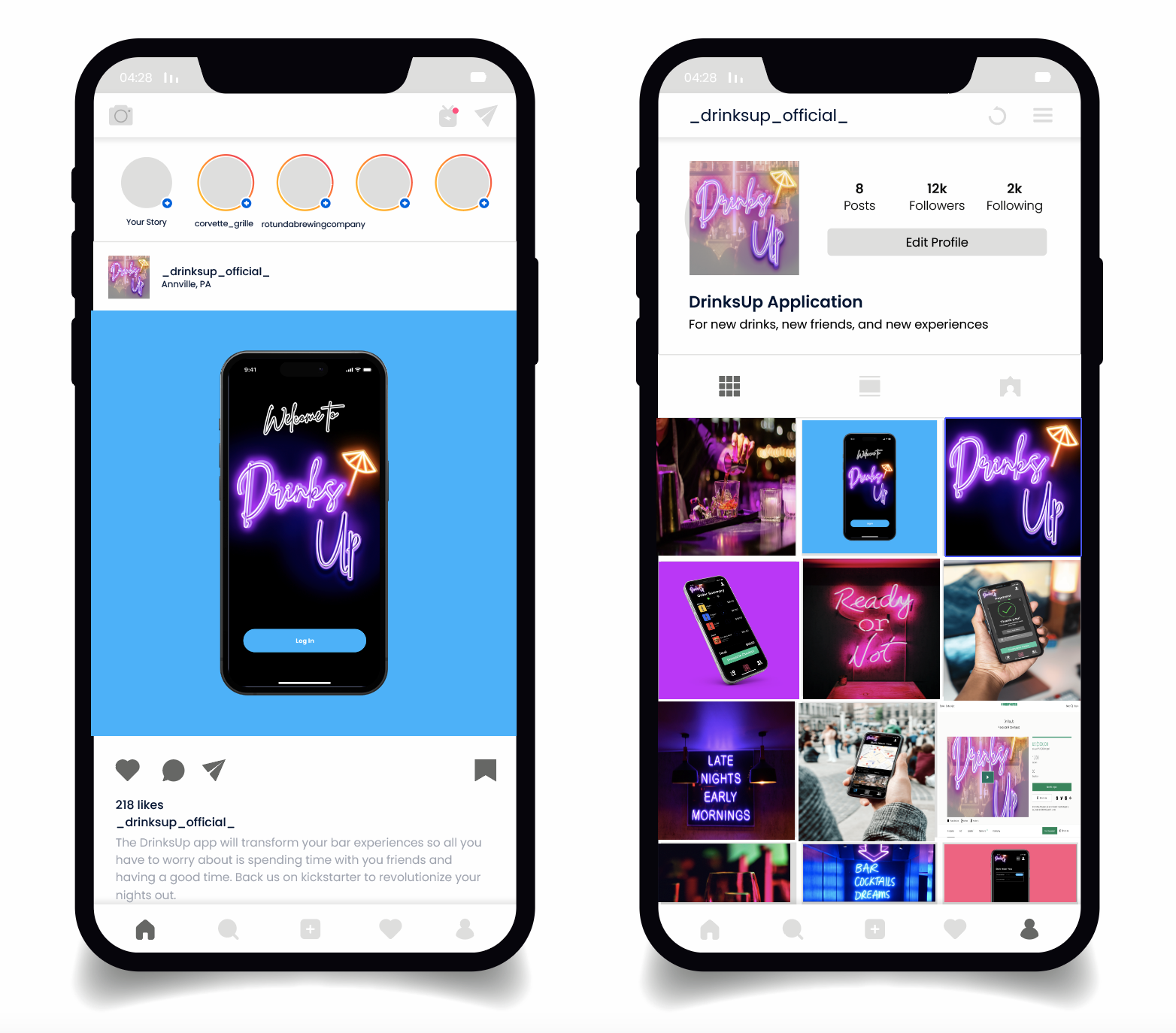
With the concept of DrinksUp, the success metrics was the development of presentable business. The business must entail a functional prototype, concepts of social media (presskit), a business model, and a presentation. The project was then presented in front of LVC alumni, students, and board members to which evaluations were made.

Tier One Competitors:
Glow Order - Uses QR Code to login, color to deliver drinks based on customer - wayfinding and payment through the app.
Bar Pay - QR code order, put what table you are at, can order on your phone and pay on your phone.
Untappd - Discover and share favorite beers
Tier Two Competitors:
Bars that do not use our system; if they could adopt our app and payment method but choose not to, all of their revenue is missed potential. Some bars may never adopt, but many can be convinced.
Venmo - payment between patrons using the app, QR code scanner to find other profiles.
Niche Competitors:
Presto - allows indirect purchasing through a Point of Sales system (implemented in Applebees, McDonalds, Red Lobster, etc.).
Snapchat - Locating your friends.
Yelp - see reviews of bars on a different system.
.png)
The initial prototype of DrinksUp laid out the fundamental features and functionalities of the app. It primarily focused on onboarding, logo development, navigation features, QR scan-in capabilities, a friends list system, and a profile section. At its core, DrinksUp aimed to be an ordering app that allowed bar patrons to conveniently obtain drinks without the need to interact directly with bartenders.
.png)
We broke the problem down into three key objectives and began to work on them in parallel. These questions drove our exploration and experimentation for whiteboarding concepts.
Discovery
How can we make using our app more appealing than traditional payment methods?
Functionality
What functionalities do we need to keep, add or take out?
Competition
What functionalities can we include to have a competitive advantage over competitors?
Results Collected

During the focus group, participants valued the convenience of ordering and paying through the app, especially in busy bars. They found the map feature, displaying nearby bars with reviews, menus, and prices, to be highly useful. Social features like tab-splitting and buying drinks for friends were also well-received, encouraging the app's use. Comparing DrinksUp to Untappd, participants noted our advantage in payment and ordering, while acknowledging the need to enhance our social functionalities. DrinksUp's broader drink selection gave us a competitive edge over Untappd in catering to non-beer drinkers.
Although most feedback was positive, there was still improvements needed within the interface. Visual consistency and the socializing feature needs to be looked at.

From the notable quotes, it was found many of the features were well-received but some interactions, such as paying, notifications, running tally, and such need clarification.
Changes that need to be looked at include adding more value to socializing aspect, term clarification, and visual consistency.
My Work
In terms of my work within the group the key pieces were the development of the conceptual app interface. This entailed wireframes, prototyping, and running a usability test on the app's interactions.
.png)
.png)
One of the main pain points was that users didn't understand the concept of paying for a tab and ordering now. To address this problem, we focused on crafting an end-to-end experience. This meant designing for the moment users enter the check-in process are able to see the menu and differentiate the concepts of ordering and adding to a tab.
Simplifying the tabbing process was a key objective. We achieved this by employing naming mechanisms such as "pending tab" and "final tab" to guide users through the stages. When users view their tab, it appears as a pending tab until they choose to purchase. Adding items to the tab sends the order without immediately processing the final bill. This step-by-step approach enhances the information architecture and promotes a user-friendly experience.
.png)
.png)
We discovered that some people found it "creepy" to have their friends visible on the map when checked-in at bars. As a result, we implemented privacy features that allow users to remove themselves from the map if desired. Additionally, to enhance the socialization features of DrinksUp, we included the option to purchase drinks for friends or even individuals users would like to get to know, creating greater value and fostering better social interactions within the DrinksUp community.
We identified a pain point regarding the need to remember to pay at bars and the lack of direct interaction when starting a tab. Our solution involved implementing notification features on the phone and including charges in the terms and conditions. This way, when a person places an order and their information is in the system, payment can be automatically processed.
.png)
.png)
Challenges
With DrinksUp multiple challenges existed both in team dynamics and wireframing:
Response
In which I adapted to the situation through:
- Regular team meetings and communication channels to ensure alignment on the vision and goals for the wireframes
- Efficient project management techniques and tools to prioritize tasks, set realistic deadlines, and maintain quality throughout the wireframing process
- User testing and feedback loops to gather insights and make iterative improvements to the wireframes based on user needs and preferences
- Encouraging a collaborative and interdisciplinary approach within the team to balance creativity and innovation with practicality and feasibility in the wireframe design obtaining feedback
Through a school project focused on creating a mock start-up, we gained valuable experience in integrating UX, advertising, and product development. The journey with DrinksUp provided significant learning opportunities and insights.